US corn production – Part 1
I am currently researching the impact of weather on corn production in the US. This blog aims to show case some of the interesting results I have found along the way.
Part 1 of this series of discusses how the US corn harvesting area has shifted over time from 1866 – 2015. The data is available from the USDA NASS Quickstats website. The data has been illustrated displayed using the bubble charts introduced by Hans Rosling in his TED 2006 lecture.
So US corn production has gradually moved northwards from the US south to the US midwest from 1866-2016. Here is another chart displaying this using a spatial map of the US.
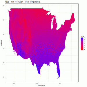
This shift north coincides with the gradual warming of the US south over the same period (1896-2000) – click on the chart below which has been produced using annual mean temperature from the PRISM dataset).
The shift in corn production probably happened due to a number of agronomic and economic factors including the warming of the south. The question is how much of this shift north is attributable to the climate change in the south.
If this shift was indeed due to the gradual warming in the south then as temperatures rise across the northern hemisphere (as predicted under the current climate change scenarios) we should witness US corn production shifting further north perhaps at a faster pace than before. This phenomenon will have a significant impact on global food security given the importance of US in global corn production.
Furthermore, this shift to cooler areas is likely to occur globally especially for rainfed agriculture. This shift is likely to pose a significant challenge for governments and policy-makers around the world and there is an urgent need to prepare for it now.
10,499 total views
