An analysis of the Italian COVID-19 data
In early spring Italy became the European epicentre of the coronavirus outbreak. As of 5th April 2020 the total COVID-19 cases in Italy were 132,547 while the total COVID-19 deaths numbered 16,523 – the highest in the world.
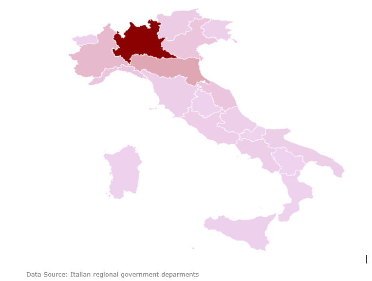
Let’s take a closer look at the Italian COVID-19 heat map. The heat map shows total deaths across Italy as at 5th April 2020. The darker the red colour the higher the number of deaths. Lombardia in north Italy has the darkest hue of red in the heat map because this is where the virus has caused the most damage in Italy. Noticeably the heat map shows a cluster around Lombardia, however thankfully this cluster is restricted to just the adjacent regions where the red hue here is also much lighter. This containment is probably due to strict social distancing across Italy.
Let’s take a closer look at the age wise Italian COVID-19 impact data. The data shows that 33% of the cases are for the 40-59 age group with a low death rate of 1%. The 60-79 age group has a high incidence (36% of the total) with a disturbingly high death rate (14%). As expected the 80+ age group is the most at risk of death with an alarming death rate (28%). 11% of the cases are for the 20-39 age group. No one is spared.
The Italian data shows that males are significantly more at risk than females with a death rate which is almost double that of females (13% versus 7%). This is very different from the New York experience and needs further investigation.
| Age group | Cases | Deaths | Death rate |
| 0-19 | 1% | 0% | 0% |
| 20-39 | 11% | 0% | 0% |
| 40-59 | 33% | 5% | 1% |
| 60-79 | 36% | 46% | 14% |
| 80+ | 19% | 49% | 28% |
| Females | 44% | 31% | 7% |
| Males | 56% | 69% | 13% |
A key factor is all of this is the proportion of cases requiring hospitalisation. This sizes up the true impact on the health services. The New York experience shows that 1 in 5 of all the cases require hospitalisation on average. The Italian data shows that 3% of the confirmed cases required admission to ICU.
Looking further at the Italian testing data shows that nearly 1 in 3 of the tests were positive, showing just how quickly the virus transmitted in the top 5 impacted Italian regions. On average across Italy 1 in every 5 tests proved positive.
| Region (worst impacted) | % of positive tests | % of cases in ICU | Death rate |
| Lombardia | 34% | 3% | 18% |
| Emilia-Romagna | 24% | 2% | 12% |
| Piemonte | 32% | 4% | 9% |
| Veneto | 8% | 3% | 6% |
| Marche | 29% | 3% | 13% |
| Overall in Italy | 19% | 3% | 12% |
The Italian death rate at 12% is calamitous. This is driven up by the high death rate in the 60+ age group. Let’s hope this moves down quickly as Italy ramps up it’s testing.
12,435 total views
